[1]:
import transportation_tutorials as tt
Creating Static Maps
In this gallery, we will demonstrate the creation of a variety of static maps. Static maps are a good choice for analytical work that will be published in a static document (i.e., on paper, or as a PDF). In these examples, we will demonstrate creating static maps using GeoPandas and Matplotlib.
[2]:
import numpy as np
import pandas as pd
import geopandas as gpd
from matplotlib import pyplot as plt
We’ll begin by loading the TAZ and MAZ shapefiles, filtering them to a restricted study area, and defining the center point.
[3]:
xmin = 905712
ymin = 905343
taz = gpd.read_file(tt.data('SERPM8-TAZSHAPE')).cx[xmin:, ymin:]
maz = gpd.read_file(tt.data('SERPM8-MAZSHAPE')).cx[xmin:, ymin:]
center = (945495, 941036)
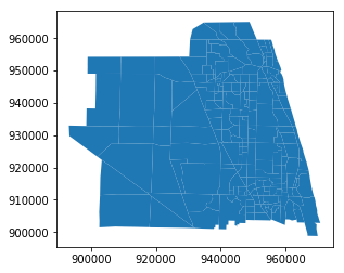
Simple Map
Simple maps showing the geographic data contained in a GeoDataFrame can be created using the plot method.
[4]:
ax = taz.plot()
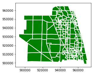
The map can be styled to be more legible by passing some styling arguments to the plot method.
[5]:
ax = taz.plot(color='green', linewidth=2, edgecolor='white')
The return value of the plot method the matplotlib AxesSubplot object on which the map has been drawn. A new plot is created by default when the plot method is called, but it this can be overridden by passing in to the function an existing AxesSubplot. This allows drawing multiple different geographic data sets on the same map. For example, we can draw TAZ’s and MAZ’s together.
[6]:
ax = maz.plot(linewidth=1,  color='green', edgecolor='white')
ax = taz.plot(ax=ax, color=(0,0,0,0), linewidth=1, edgecolor='black')
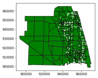
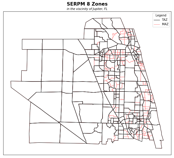
The ability to reuse or modify the AxesSubplot object unlocks all the usual capabilties of the matplotlib package. We can use the typical matplotlib tools for figure creation and manipulation to customize the map as desired, including changing labels, borders, fonts, etc. For example:
[7]:
fig, ax = plt.subplots(figsize=(12,9))
ax.axis('on')      # do show axis as a frame
ax.set_xticks([])  # but no tick marks
ax.set_yticks([])  # one either axis
ax.set_title("SERPM 8 Zones", fontweight='bold', fontsize=16, pad=20)
ax.annotate('in the viscinity of Jupiter, FL',
            xy=(0.5, 1.0), xycoords='axes fraction',
            xytext=(0, 5), textcoords='offset points',
            horizontalalignment='center',
            fontstyle='italic')
from matplotlib.lines import Line2D
legend_elements = [
    Line2D([0], [0], color='black', linewidth=1, label='TAZ'),
    Line2D([0], [0], color='red', linewidth=0.5, label='MAZ'),
]
ax.legend(handles=legend_elements, title='Legend')
ax = maz.plot(ax=ax, linewidth=0.5,  color='white', edgecolor='red', label='MAZ')
ax = taz.plot(ax=ax, color=(0,0,0,0), linewidth=1, edgecolor='black')
Mapping Data
One of the input files for SERPM 8 is a MAZ-level demographics file. The file for the 2015 base year is included in the tutorial data, and we can load it with the read_csv function.
[8]:
mazd = pd.read_csv(tt.data('SERPM8-MAZDATA', '*.csv'))
Use info to see a summary of the DataFrame.
[9]:
mazd.info()
<class 'pandas.core.frame.DataFrame'>
RangeIndex: 12022 entries, 0 to 12021
Data columns (total 76 columns):
mgra                            12022 non-null int64
TAZ                             12022 non-null int64
HH                              12022 non-null int64
POP                             12022 non-null int64
emp_self                        12022 non-null int64
emp_ag                          12022 non-null int64
emp_const_non_bldg_prod         12022 non-null int64
emp_const_non_bldg_office       12022 non-null int64
emp_utilities_prod              12022 non-null int64
emp_utilities_office            12022 non-null int64
emp_const_bldg_prod             12022 non-null int64
emp_const_bldg_office           12022 non-null int64
emp_mfg_prod                    12022 non-null int64
emp_mfg_office                  12022 non-null int64
emp_whsle_whs                   12022 non-null int64
emp_trans                       12022 non-null int64
emp_retail                      12022 non-null int64
emp_prof_bus_svcs               12022 non-null int64
emp_prof_bus_svcs_bldg_maint    12022 non-null int64
emp_pvt_ed_k12                  12022 non-null int64
emp_pvt_ed_post_k12_oth         12022 non-null int64
emp_health                      12022 non-null int64
emp_personal_svcs_office        12022 non-null int64
emp_amusement                   12022 non-null int64
emp_hotel                       12022 non-null int64
emp_restaurant_bar              12022 non-null int64
emp_personal_svcs_retail        12022 non-null int64
emp_religious                   12022 non-null int64
emp_pvt_hh                      12022 non-null int64
emp_state_local_gov_ent         12022 non-null int64
emp_scrap_other                 12022 non-null int64
emp_fed_non_mil                 12022 non-null int64
emp_fed_mil                     12022 non-null int64
emp_state_local_gov_blue        12022 non-null int64
emp_state_local_gov_white       12022 non-null int64
emp_public_ed                   12022 non-null int64
emp_own_occ_dwell_mgmt          12022 non-null int64
emp_fed_gov_accts               12022 non-null int64
emp_st_lcl_gov_accts            12022 non-null int64
emp_cap_accts                   12022 non-null int64
emp_total                       12022 non-null int64
collegeEnroll                   12022 non-null int64
otherCollegeEnroll              12022 non-null int64
AdultSchEnrl                    12022 non-null int64
EnrollGradeKto8                 12022 non-null int64
EnrollGrade9to12                12022 non-null int64
PrivateEnrollGradeKto8          12022 non-null int64
ech_dist                        12022 non-null int64
hch_dist                        12022 non-null int64
parkarea                        12022 non-null int64
hstallsoth                      12022 non-null int64
hstallssam                      12022 non-null int64
hparkcost                       12022 non-null int64
numfreehrs                      12022 non-null int64
dstallsoth                      12022 non-null int64
dstallssam                      12022 non-null int64
dparkcost                       12022 non-null int64
mstallsoth                      12022 non-null int64
mstallssam                      12022 non-null int64
mparkcost                       12022 non-null float64
TotInt                          12022 non-null int64
DUDen                           12022 non-null float64
EmpDen                          12022 non-null float64
PopDen                          12022 non-null float64
RetEmpDen                       12022 non-null float64
IntDenBin                       12022 non-null int64
EmpDenBin                       12022 non-null int64
DuDenBin                        12022 non-null int64
POINT_X                         12022 non-null int64
POINT_Y                         12022 non-null int64
ACRES                           12022 non-null int64
HotelRoomTotal                  12022 non-null int64
mall_flag                       12022 non-null int64
beachAcres                      12022 non-null int64
geoSRate                        12022 non-null int64
geoSRateNm                      12022 non-null int64
dtypes: float64(5), int64(71)
memory usage: 7.0 MB
We can join the demographics table to the shape file we loaded previously, to enable some visualizations on this data. This can be done with the merge method of DataFrames.
[10]:
maz1 = maz.merge(mazd, how='left', left_on='MAZ', right_on='mgra')
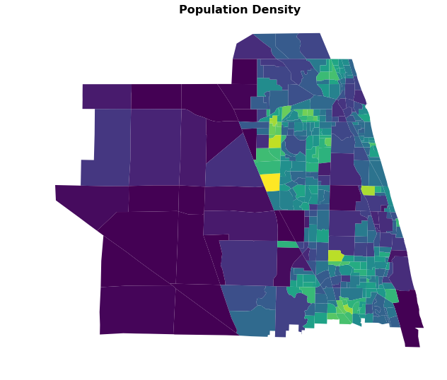
Choropleth Maps
A choropleth map is a map with areas colored, shaded, or patterned in proportion to some measured value for the region displayed. This kind of map is commonly used to display things like population density.
A GeoDataFrame can be used to create a choropleth map simply by passing a column name to the plot method, where the named column contains the data to be displayed.
[11]:
fig, ax = plt.subplots(figsize=(12,9))
ax.axis('off') # don't show axis
ax.set_title("Population Density", fontweight='bold', fontsize=16)
ax = maz1.plot(ax=ax, column='PopDen')
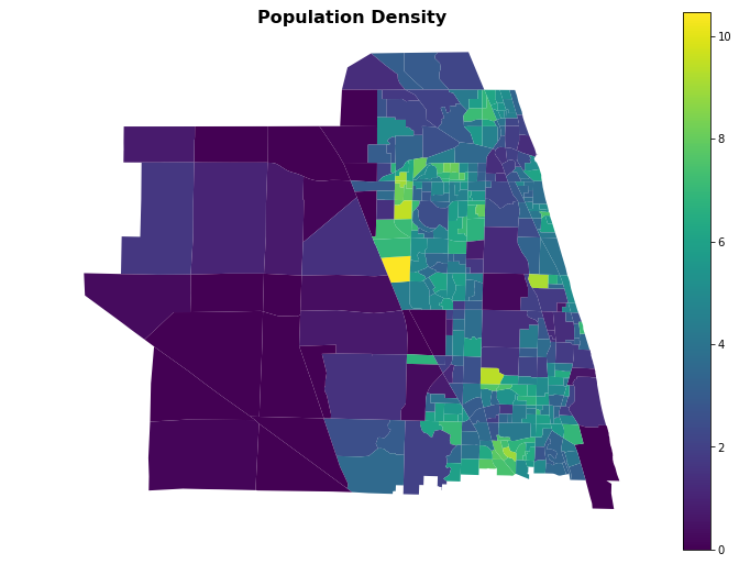
You can also add a legend easily.
[12]:
fig, ax = plt.subplots(figsize=(12,9))
ax.axis('off') # don't show axis
ax.set_title("Population Density", fontweight='bold', fontsize=16)
ax = maz1.plot(ax=ax, column='PopDen', legend=True)
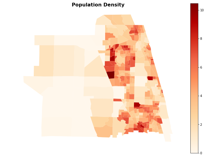
Or change the colors, by giving a cmap argument. Any named colormap from matplotlib can be used.
[13]:
fig, ax = plt.subplots(figsize=(12,9))
ax.axis('off') # don't show axis
ax.set_title("Population Density", fontweight='bold', fontsize=16)
ax = maz1.plot(ax=ax, column='PopDen', legend=True, cmap='OrRd')
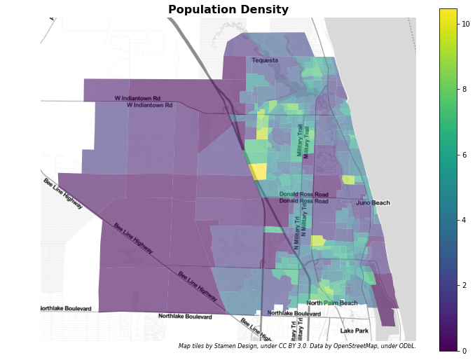
Adding a Background
If we would like some additional context for the map, we can add a background layer with some familiar map content. To do so, we will need to get some map tiles (rendered map pieces), and we can use contextily to help automate this.
[14]:
import contextily as ctx

def add_basemap(ax, zoom, url='http://tile.stamen.com/terrain/tileZ/tileX/tileY.png'):
    xmin, xmax, ymin, ymax = ax.axis()
    basemap, extent = ctx.bounds2img(xmin, ymin, xmax, ymax, zoom=zoom, url=url)
    ax.imshow(basemap, extent=extent, interpolation='bilinear')
    # restore original x/y limits
    ax.axis((xmin, xmax, ymin, ymax))

    attribution_txt = "Map tiles by Stamen Design, under CC BY 3.0. Data by OpenStreetMap, under ODbL."
    ax.annotate(
        attribution_txt,
        xy=(1.0, 0.0), xycoords='axes fraction',
        xytext=(0, -10), textcoords='offset points',
        horizontalalignment='right',
        fontstyle='italic',
        fontsize=8,
    )

    return ax
Web map tiles are typically provided in Web Mercator EPSG 3857, so we need to make sure to convert our data first to the same CRS to combine our polygons and background tiles in the same map.
[15]:
maz2 = maz1.to_crs(epsg=3857)
Then we can create the map. We set the alpha (opacity) of the choropleth plot itself to be only 0.6, so we can see the map tile detail underneath the colors.
[16]:
fig, ax = plt.subplots(figsize=(12,9))
ax.axis('off') # don't show axis
ax.set_title("Population Density", fontweight='bold', fontsize=16)
ax = maz2.plot(ax=ax, alpha=0.6, linewidth=0, cmap='viridis', column='PopDen', legend=True)
ax = add_basemap(ax, zoom=12, url=ctx.sources.ST_TONER_LITE)
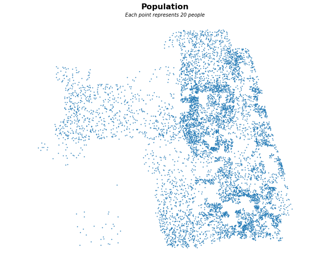
Dot Density Map
For certain kinds of data, it might make sense to plot a dot density map instead of a choropleth.
We’ll use some code from the tutorials package to generate a dot density map the shows population density in each MAZ.
[17]:
tt.show_file(tt.tools.point_map)
# Code based on an original given in
# https://github.com/agaidus/census_data_extraction/blob/master/census_mapper.py

import geopandas as gpd
import pandas as pd
from shapely.geometry import Point
from numpy.random import RandomState, uniform


def generate_random_points_in_polygon(poly, num_points, seed=None):
    """
   Create a list of randomly generated points within a polygon.

   Parameters
   ----------
   poly : Polygon
   num_points : int
           The number of random points to create within the polygon
   seed : int, optional
           A random seed

   Returns
   -------
   List
   """
    min_x, min_y, max_x, max_y = poly.bounds
    points = []
    i = 0
    while len(points) < num_points:
            s = RandomState(seed + i) if seed else RandomState(seed)
            random_point = Point([s.uniform(min_x, max_x), s.uniform(min_y, max_y)])
            if random_point.within(poly):
                    points.append(random_point)
            i += 1
    return points


def generate_points_in_areas(gdf, values, points_per_unit=1, seed=None):
    """
   Create a GeoSeries of random points in polygons.

   Parameters
   ----------
   gdf : GeoDataFrame
           The areas in which to create points
   values : str or Series
           The [possibly scaled] number of points to create in each area
   points_per_unit : numeric, optional
           The rate to scale the values in point generation.
   seed : int, optional
           A random seed

   Returns
   -------
   GeoSeries
   """
    geometry = gdf.geometry
    if isinstance(values, str) and values in gdf.columns:
            values = gdf[values]
    new_values = (values / points_per_unit).astype(int)
    g = gpd.GeoDataFrame(data={'vals': new_values}, geometry=geometry)
    a = g.apply(lambda row: tuple(generate_random_points_in_polygon(row['geometry'], row['vals'], seed)), 1)
    b = gpd.GeoSeries(a.apply(pd.Series).stack(), crs=geometry.crs)
    b.name = 'geometry'
    return b
The generate_points_in_areas function above will allow us to generate a set of point to plot, filling in the dot density map.
[18]:
random_points = tt.tools.point_map.generate_points_in_areas(maz1, values='POP', points_per_unit=20,)
[19]:
fig, ax = plt.subplots(figsize=(12,9))
ax.axis('off') # don't show axis
ax.set_title("Population", fontweight='bold', fontsize=16, pad=20)
ax.annotate('Each point represents 20 people',
            xy=(0.5, 1.0), xycoords='axes fraction',
            xytext=(0, 5), textcoords='offset points',
            horizontalalignment='center',
            fontstyle='italic')
ax = random_points.plot(ax=ax, markersize=1)
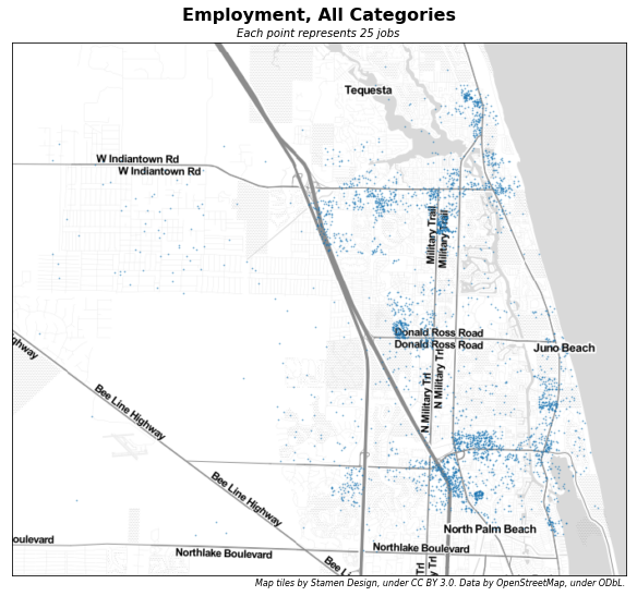
Dot density maps render very nicely on top of the Stamen Toner Light tiles.
[20]:
emp_points = tt.tools.point_map.generate_points_in_areas(maz2, values='emp_total', points_per_unit=25)
[21]:
fig, ax = plt.subplots(figsize=(12,9))
ax.axis('on')      # do show axis as a frame
ax.set_xticks([])  # but no tick marks
ax.set_yticks([])  # one either axis
ax.set_title("Employment, All Categories", fontweight='bold', fontsize=16, pad=20)
ax = emp_points.plot(ax=ax, markersize=1, alpha=0.33)
ax.annotate('Each point represents 25 jobs',
            xy=(0.5, 1.0), xycoords='axes fraction',
            xytext=(0, 5), textcoords='offset points',
           horizontalalignment='center',
           fontstyle='italic')
ax = add_basemap(ax, zoom=12, url=ctx.sources.ST_TONER_LITE)
It is also possible to plot multiple different sets of dot density data on the same map. In the following example, we pull out retail and healthcare employment, and plot those in different colors.
[22]:
i = 'retail'
j = 'health'
i_points = tt.tools.point_map.generate_points_in_areas(maz2, values=f'emp_{i}', points_per_unit=25)
j_points = tt.tools.point_map.generate_points_in_areas(maz2, values=f'emp_{j}', points_per_unit=25)
maz2[f'emp_allother'] = maz2.emp_total - maz2[f'emp_{i}'] - maz2[f'emp_{j}']
o_points = tt.tools.point_map.generate_points_in_areas(maz2, values=f'emp_allother', points_per_unit=25)
[23]:
fig, ax = plt.subplots(figsize=(12,9))
ax.axis('on')      # do show axis as a frame
ax.set_xticks([])  # but no tick marks
ax.set_yticks([])  # one either axis
ax.set_title("Employment, Various Categories", fontweight='bold', fontsize=16, pad=20)
ax = i_points.plot(ax=ax, markersize=1, alpha=0.33, color='red')
ax = j_points.plot(ax=ax, markersize=1, alpha=0.33, color='green')
ax = o_points.plot(ax=ax, markersize=1, alpha=0.33)
legend_elements = [
    Line2D([0], [0], marker='o', lw=0, color='red', label='Retail'),
    Line2D([0], [0], marker='o', lw=0, color='green', label='Healthcare'),
    Line2D([0], [0], marker='o', lw=0, color='blue', label='Other'),
]
ax.legend(handles=legend_elements, title='Legend')
ax.annotate('Each point represents 25 jobs',
            xy=(0.5, 1.0), xycoords='axes fraction',
            xytext=(0, 5), textcoords='offset points',
           horizontalalignment='center',
           fontstyle='italic')
ax = add_basemap(ax, zoom=12, url=ctx.sources.ST_TONER_LITE)
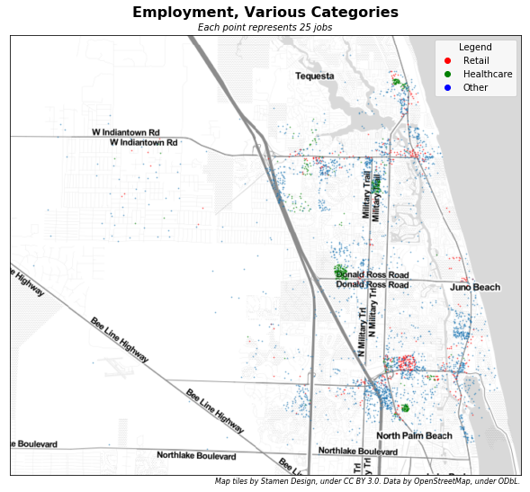
Using different colored points helps to highlight important traffic generators, including the Scripps Research Institute (green, on Donald Ross Road) and the Gardens Mall (red).