[3]:
import transportation_tutorials as tt
from matplotlib import pyplot as plt
import pandas as pd
import numpy as np
Histograms and Frequency Plots
In this section, we will review the creation of histograms and frequency plots for data. These two kinds of plots are very similar: histograms plot the distribution of continuous data by grouping similar values together in (typically homogeneously sized) bins, while frequency plots are a similar visualization for discrete (categorical) data that is by its nature already “binned”.
Computing Frequency Data
We’ll create some frequency plots of trip mode using data from the example trips data.
[4]:
trips = pd.read_csv(tt.data('SERPM8-BASE2015-TRIPS'))
[5]:
trips.info()
<class 'pandas.core.frame.DataFrame'>
RangeIndex: 123874 entries, 0 to 123873
Data columns (total 20 columns):
hh_id              123874 non-null int64
person_id          123874 non-null int64
person_num         123874 non-null int64
tour_id            123874 non-null int64
stop_id            123874 non-null int64
inbound            123874 non-null int64
tour_purpose       123874 non-null object
orig_purpose       123874 non-null object
dest_purpose       123874 non-null object
orig_mgra          123874 non-null int64
dest_mgra          123874 non-null int64
parking_mgra       123874 non-null int64
stop_period        123874 non-null int64
trip_mode          123874 non-null int64
trip_board_tap     123874 non-null int64
trip_alight_tap    123874 non-null int64
tour_mode          123874 non-null int64
smplRate_geo       123874 non-null float64
autotech           123874 non-null int64
tncmemb            123874 non-null int64
dtypes: float64(1), int64(16), object(3)
memory usage: 18.9+ MB
The pandas.Series object has a value_counts method that counts the number of each of unique values in the series. It returns a new Series, with the original values as the index. By default the result is sorted in decreasing order of frequency, but by setting sort to False we can get the results in order by the original values, which in this case will make a more readable figure (as similar modes have adjacent code numbers).
[6]:
trip_mode_counts = trips.trip_mode.value_counts(sort=False)
trip_mode_counts
[6]:
1     77187
2      6659
3     19264
4      1348
5     10355
6       872
9      3290
10     1563
11      330
14        6
15       16
16        5
17        9
18        5
19       18
20     2947
Name: trip_mode, dtype: int64
There are 20 distinct trip modes recognized in the SERPM trip file. They are identified by code numbers, but we can create a python dictionary that maps the code numbers to slightly more human-friendly names that will be used in our figures.
[7]:
trip_mode_dictionary = {
    1: "DRIVEALONEFREE",
    2: "DRIVEALONEPAY",
    3: "SHARED2GP",
    4: "SHARED2PAY",
    5: "SHARED3GP",
    6: "SHARED3PAY",
    7: "TNCALONE",
    8: "TNCSHARED",
    9: "WALK",
    10: "BIKE",
    11: "WALK_MIX",
    12: "WALK_PRMW",
    13: "WALK_PRMD",
    14: "PNR_MIX",
    15: "PNR_PRMW",
    16: "PNR_PRMD",
    17: "KNR_MIX",
    18: "KNR_PRMW",
    19: "KNR_PRMD",
    20: "SCHBUS",
}
We can apply this dictionary to the trip_mode_counts index using the map method.
[8]:
trip_mode_counts.index = trip_mode_counts.index.map(trip_mode_dictionary)
trip_mode_counts
[8]:
DRIVEALONEFREE    77187
DRIVEALONEPAY      6659
SHARED2GP         19264
SHARED2PAY         1348
SHARED3GP         10355
SHARED3PAY          872
WALK               3290
BIKE               1563
WALK_MIX            330
PNR_MIX               6
PNR_PRMW             16
PNR_PRMD              5
KNR_MIX               9
KNR_PRMW              5
KNR_PRMD             18
SCHBUS             2947
Name: trip_mode, dtype: int64
Plotting Frequency Data
Now we have a Series that contains the data we want to use. We can plot this data using the plot method. This convenient method makes it easy to generate a quick visualization of the data.
[9]:
trip_mode_counts.plot(kind='bar');
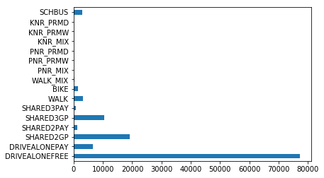
The plot method takes a kind argument to define the kind of plot to generate – a variety of kinds are available, including the ‘bar’ chart we see above, or a horizontally oriented version in a ‘barh’ chart:
[14]:
trip_mode_counts.plot(kind='barh');
or a ‘pie’ chart:
[15]:
trip_mode_counts.plot(kind='pie');
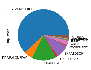
You might notice the plotting function isn’t necessarily smart about things like overlapping labels. For a quick visualization created to help you understand your own data, this might not be a big deal, but for generating figures that will be inserted into reports or shared with others, you’ll want to manage these kinds of problems by manipulating the visualization data before plotting it.
Customizing Plots
If the default output isn’t exactly what you want, it is possible to customize the output, both by giving additional arguments to the plot method, and by manipulating the resulting chart (actually a Axes object) before rendering the results.
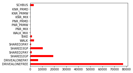
The arguments that the plot method will accept vary depending on the plot kind, to customize the appearance of the result. For example, the barh plot can accept arguments for color and figsize to make a tall figure with red bars:
[32]:
trip_mode_counts.plot(kind='barh', color='red');
But using the color argument on a pie chart doens’t make sense and results in an error:
[33]:
try:
    trip_mode_counts.plot(kind='pie', color='red')
except TypeError as err:
    print(err)
pie() got an unexpected keyword argument 'color'
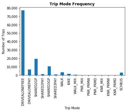
A more powerful set of figure customization tools is available by manipulating the return value of the plot method, which is a matplotlib Axes object. This object is can be further modified or customized to create a well crafted output figure. For example, we can change the colors, add some axis labels, and format the tick marks like this:
[54]:
ax = trip_mode_counts.plot(kind='bar')
ax.set_title("Trip Mode Frequency", fontweight='bold')
ax.set_xlabel("Trip Mode")
ax.set_ylabel("Number of Trips");
ax.set_yticklabels([f"{i:,.0f}" for i in ax.get_yticks()])
ax.set_yticks([5000,15000,25000,35000], minor=True);
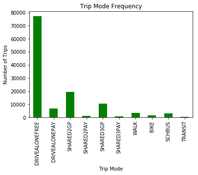
This figure has a lot of detail that is probably unnecessary for our presentation. In particular, there are a lot of different variations of transit modes, but most have a trivial share of trips (at least within the Jupiter study area). It might be better to aggregate all the transit trips into a single bucket for this figure. We could do so in a variety of ways – we could manipulate the final counts to sum up all the transit parts, or we could manipulate the original source data before we tally the numbers. Let’s do the latter: we’ll add a new code (21) to the dictionary for general transit, map all the transit modes to it, and recompute the tally.
[10]:
tm = {11,12,13,14,15,16,17,18,19}
trip_mode_dictionary[21] = 'TRANSIT'
trip_mode_counts = trips.trip_mode.map(lambda x: 21 if x in tm else x).value_counts(sort=False)
trip_mode_counts.index = trip_mode_counts.index.map(trip_mode_dictionary)
trip_mode_counts
[10]:
DRIVEALONEFREE    77187
DRIVEALONEPAY      6659
SHARED2GP         19264
SHARED2PAY         1348
SHARED3GP         10355
SHARED3PAY          872
WALK               3290
BIKE               1563
SCHBUS             2947
TRANSIT             389
Name: trip_mode, dtype: int64
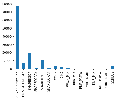
[11]:
ax = trip_mode_counts.plot(kind='bar', color='green')
ax.set_title("Trip Mode Frequency")
ax.set_xlabel("Trip Mode")
ax.set_ylabel("Number of Trips");
Plotting Histogram Data
We’ll create some histograms of household income using data from the example households data.
[55]:
hh = pd.read_csv(tt.data('SERPM8-BASE2015-HOUSEHOLDS'), index_col=0)
hh.set_index('hh_id', inplace=True)
[56]:
hh.info()
<class 'pandas.core.frame.DataFrame'>
Int64Index: 18178 entries, 1690841 to 1726370
Data columns (total 8 columns):
home_mgra       18178 non-null int64
income          18178 non-null int64
autos           18178 non-null int64
transponder     18178 non-null int64
cdap_pattern    18178 non-null object
jtf_choice      18178 non-null int64
autotech        18178 non-null int64
tncmemb         18178 non-null int64
dtypes: int64(7), object(1)
memory usage: 1.2+ MB
As with plotting general figures, pandas includes a pre-made method for making simple histograms, using the hist method on a pandas.Series.
[58]:
hh.income.hist();
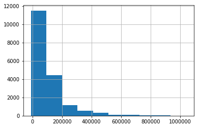
Also like the plot method, the hist method includes a limited ability to customize the output by passing certain arguments. For example, we can increase the number of bins from the default 10 to a more interesting 50, get rid of the grid lines, and change the color to red:
[65]:
hh.income.hist(bins=50, grid=False, color='red');

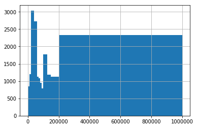
It’s also possible to give explicit boundaries to the bins argument of hist by using a list or array, but this is not generally useful as this function doesn’t properly normalize the result, giving a histogram that is at best misleading:
[85]:
bins = np.array([0,10,20,40,60,70,80,90,100,125,150,200,1000]) * 1000
hh.income.hist(bins=bins);
Instead, if non-uniform bin sizes are desired, it’s better to use the hist function from a matplotlib Axes, which allows for correct normalization for density:
[90]:
fig, ax = plt.subplots()
ax.hist(hh.income, bins=bins, density=True);
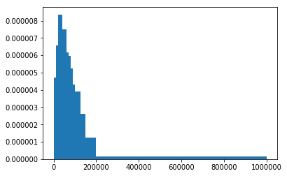
You’ll note that the y-axis on this figure has changed scale, as instead of giving the count of observations in each bin it now gives the density (i.e., expected number of households within each one-dollar-width interval, averaged across all such intervals in each bin). The resulting figure looks much more similar to the red histogram shown above.
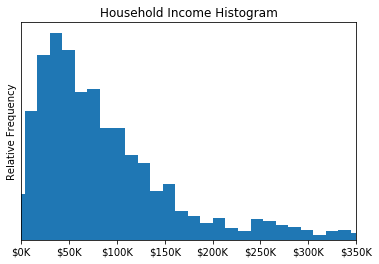
Also like plot, the return value of the hist method is a matplotlib Axes object, that can be further modified or customized to create a well crafted output figure. For example, we can change the plot limits on the x axis so we don’t give so much area to plot a long tail, add some axis labels, and format the tick marks like this:
[101]:
ax = hh.income.hist(grid=False, bins=80)
ax.set_xlim(0,350_000)
ax.set_title("Household Income Histogram");
ax.set_xticklabels([f"${i/1000:.0f}K" for i in ax.get_xticks()]);
ax.set_ylabel("Relative Frequency");
ax.set_yticks([]);