[1]:
import transportation_tutorials as tt
from matplotlib import pyplot as plt
import pandas as pd
import numpy as np
import seaborn as sns
Basic Data Visualization
Python offers a variety of data visualization packages, but the most fundamental, and most ubiquitous, is matplotlib. Typically, this package most often used with the pyplot tools, which provides a plotting command interface similar to what you have with a tool like MATLAB.
For example, if you have some data like this:
[2]:
total_florida_vmt = pd.Series({
    2003: 508_607_851,
    2004: 537_494_319,
    2005: 550_614_540,
    2006: 558_308_386,
    2007: 562_798_032,
    2008: 542_334_376,
    2009: 538_088_986,
    2010: 536_315_479,
    2011: 525_630_013,
    2012: 522_879_155,
    2013: 527_950_180,
    2014: 550_795_629,
    2015: 566_360_175,
    2016: 588_062_806,
    2017: 599_522_329,
})
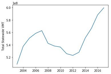
You can draw a plot and label an axis as simply as this:
[3]:
plt.plot(total_florida_vmt)
plt.ylabel("Total Statewide VMT");
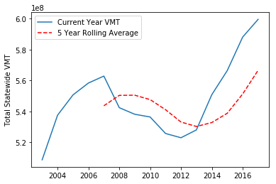
You can also plot more than one thing on the same figure. For example, we can plot both VMT and a 5 year rolling average of VMT on the same figure, including a legend:
[4]:
plt.plot(total_florida_vmt, label='Current Year VMT')
plt.plot(total_florida_vmt.rolling(5).mean(), 'r--', label='5 Year Rolling Average')
plt.ylabel("Total Statewide VMT")
plt.legend();
Multi-Dimensional Data
In this section, we will look at some basic data visualization techniques for multi-dimensional data. We’ll begin by loading and preprocessing some data to analyze.
[5]:
hh = pd.read_csv(tt.data('SERPM8-BASE2015-HOUSEHOLDS'), index_col=0)
persons = pd.read_csv(tt.data('SERPM8-BASE2015-PERSONS'), index_col=0)
trips = pd.read_csv(tt.data('SERPM8-BASE2015-TRIPS'), index_col=0)
[6]:
# Add household income to persons
persons = persons.merge(hh.income, left_on='hh_id', right_on=hh.hh_id)

# Count of persons per HH
hh = hh.merge(
    persons.groupby('hh_id').size().rename('hhsize'),
    left_on=['hh_id'],
    right_index=True,
)

# Count of trips per HH
hh = hh.merge(
    trips.groupby(['hh_id']).size().rename('n_trips'),
    left_on=['hh_id'],
    right_index=True,
)
Let’s look at what data we have now in the Households table.
[7]:
hh.info()
<class 'pandas.core.frame.DataFrame'>
Int64Index: 17260 entries, 426629 to 568932
Data columns (total 11 columns):
hh_id           17260 non-null int64
home_mgra       17260 non-null int64
income          17260 non-null int64
autos           17260 non-null int64
transponder     17260 non-null int64
cdap_pattern    17260 non-null object
jtf_choice      17260 non-null int64
autotech        17260 non-null int64
tncmemb         17260 non-null int64
hhsize          17260 non-null int64
n_trips         17260 non-null int64
dtypes: int64(10), object(1)
memory usage: 1.6+ MB
Scatter Plots
Suppose we want to understand the relationship between household income and the number of trips taken. We can create a scatterplot of the data using the plot method on the households pandas.DataFrame. This function takes a kind argument that indicates what kind of plot to generate, plus x and y arguments that indicate the names of the columns in the DataFrame to plot.
[8]:
hh.plot(kind='scatter', x='income', y='n_trips');
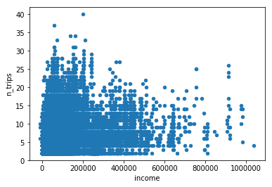
There’s a lot of data plotted here – so much so that the more dense parts of the figure just look like a homogenous blob of blue. One way to change this figure to give it a little more context is to set the opacity (“alpha”) for each point to a relatively small value. This results in the individual points being de-emphasized, and only areas where there is truely a preponderance of points become solid blue. The alpha can be set as a keywork argument to the plot method:
[9]:
hh.plot(kind='scatter', x='income', y='n_trips', alpha=0.01);
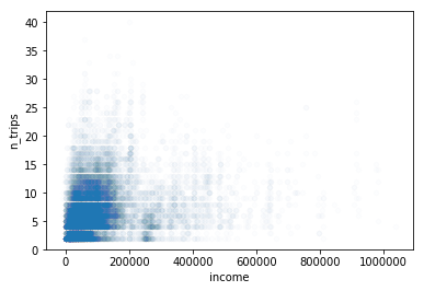
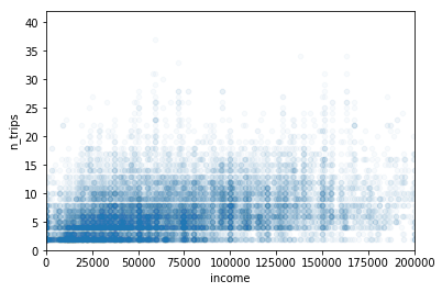
This figure provides a bit more insight into the real distribution of the data: nearly all of it is in the area below $200K in household annual income. If we want to focus our plot on that region, we can adjust the axis limits on the x axis, so that it only includes the zero to 200K range.
The plot method returns a matplotlib Axes object, which can be modified to give the desired result before the final figure is rendered. In this case, we can use the set_xlim method to set the limits on the x axis:
[10]:
ax = hh.plot(kind='scatter', x='income', y='n_trips', alpha=0.03)
ax.set_xlim(0,200_000);
Plotting trip making against income is interesting, but what if we wanted to see the relationship between household size and automobile ownership? We could try the same approach:
[11]:
hh.plot(kind='scatter', x='hhsize', y='autos', alpha=0.01);
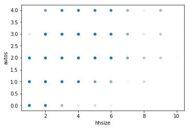
Unfortunately, there’s not a lot of unique values for these two variables, and the thousands of points in the scatter plot are all overlaid on a very limited number of points in the figure. While the opacity approach does permit a bit of differentiation between the unusual points and the others, it is hard to discern much information in the middle region of the figure. In fact, it may surprise someone viewing this figure that more than half of all the observation in the dataset occur on just two points.
Heatmaps
Rather than a scatter plot, it may be more appropriate to visualize this data in a heatmap. This kind of visualization will take the same information as displayed above, but rather than displaying the intensity of each point by layering partially transparent points, we can directly compute the mass of each point using a pivot table, and then display the data in a color coded table that is reasonably normalized to help highlight the information you want to convey. To do this, we’ll feed the data
from a pivot table to the `heatmap <https://seaborn.pydata.org/generated/seaborn.heatmap.html>`__ function from the seaborn package.
[12]:
sns.heatmap(
    hh.pivot_table(
        index='hhsize',
        columns='autos',
        aggfunc='size'
    ).fillna(0),
    annot=True,
    fmt=",.0f"
);
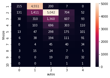
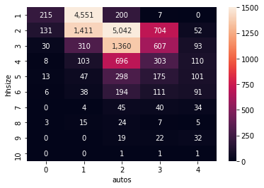
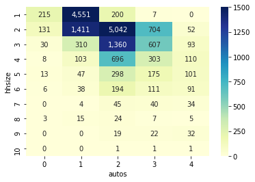
The figure above much more clearly articulates the preponderance of observations in just 2 categories: one person-one car, and 2 people-2 cars. In fact, the over abundance of these two values is washing out much of the other detail in this visualization. As indicated in the documentation for the `heatmap <https://seaborn.pydata.org/generated/seaborn.heatmap.html>`__ function, we can manually override the default upper bound of the colorscale by setting a vmax argument. This will set all
of the values above the new maximum to the color at the maximum point. Since we are also using the annot argument to add annotations of the actual underlying values, it is still clear that the two peak values are well above the top of the colorscale, while a few other cells are shown with some more useful variation.
[13]:
sns.heatmap(
    hh.pivot_table(
        index='hhsize',
        columns='autos',
        aggfunc='size'
    ).fillna(0),
    annot=True,
    fmt=",.0f",
    vmax=1500,
);
The seaborn module provides a number of useful customization options as well, which are generally well documented online. For example, we can change the color scheme, adopting any named colormap available in the matplotlib package.
[14]:
sns.heatmap(
    hh.pivot_table(
        index='hhsize',
        columns='autos',
        aggfunc='size'
    ).fillna(0),
    annot=True,
    fmt=",.0f",
    vmax=1500,
    cmap="YlGnBu",
);
Box Plots
If one dimension to be visualized is discrete and the other is continuous, it may be useful to generate box plots to help compare distribution. In these figures, the “box” at the middle of the plot covers the interquartile range (between the 25th and 75th percentiles, the whiskers show some of the rest of the range (by default, up to 1.5 times the interquartile range), and dots show the remaining outliers.
[15]:
# Create a hhsize variable capped at 5
hh['hhsize5'] = np.fmin(hh['hhsize'], 5)
[16]:
data = list(hh.groupby('hhsize5').income)
plt.boxplot(
    [i[1] for i in data],
    vert=False,
    labels=[i[0] for i in data],
)
plt.title('Household Income by Household Size')
plt.xlabel('Household Income')
plt.ylabel('Household Size');
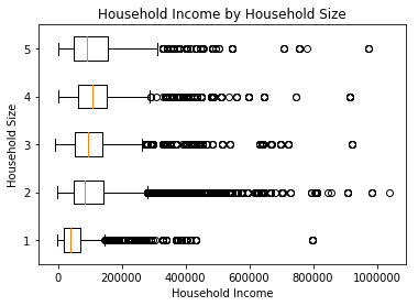
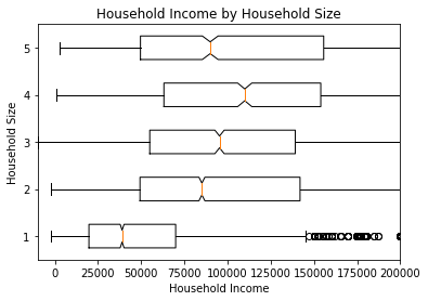
The figure shown includes quite a lot of outliers across a very large range of incomes, but much of the detail in the highest echelons of income is not really important for transportation planning analysis. We can adjust the figure’s limits on the horizontal axis to focus in on the more relevant portion of the data.
[17]:
plt.boxplot(
    [i[1] for i in data],
    vert=False,
    labels=[i[0] for i in data],
    notch=True,
)
plt.title('Household Income by Household Size')
plt.xlim(-10_000,200_000)
plt.xlabel('Household Income')
plt.ylabel('Household Size');
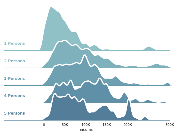
Fancy Figures
More complex visualizations can be created using Seaborn, and are not too hard to create by following and modifying recipes found on the gallery in the Seaborn documention. As an example, this code snippet is lightly edited from the recipe offered for overlapping ridge plots.
[18]:
sns.set(style="white", rc={"axes.facecolor": (0, 0, 0, 0)})

# Initialize the FacetGrid object
pal = sns.cubehelix_palette(10, rot=-.25, light=.7)
g = sns.FacetGrid(
    hh[hh.income<=300_000], row="hhsize5", hue="hhsize5",
    aspect=7, height=1.25, palette=pal,
    xlim=(-95000,300000)
)

# Draw the densities in a few steps
g.map(sns.kdeplot, "income", clip_on=False, shade=True, alpha=1, lw=1.5, bw=5000)
g.map(sns.kdeplot, "income", clip_on=False, color="w", lw=4, bw=5000)
g.map(plt.axhline, y=0, lw=2, clip_on=False)

# Define and use a simple function to label the plot in axes coordinates
def label(x, color, label):
    ax = plt.gca()
    ax.text(0, .15, f'{label} Persons', fontweight="bold", color=color,
            ha="left", va="center", transform=ax.transAxes)

g.map(label, "income")

# Set the subplots to overlap
g.fig.subplots_adjust(hspace=-0.625)

# Remove axes details that don't play well with overlap
g.set_titles("")
g.set(yticks=[],
      xticks=[       0,50_000,100_000,150_000,200_000,300_000],
      xticklabels=['0','50K' ,'100K' ,'150K' ,'200K'  ,'300K',],
     )
g.despine(bottom=True, left=True);
g.row_names = [f'HH Size {i}' for i in g.row_names]
[ ]: